Aesthetica is a British arts and culture magazine. Founded in 2002, Aesthetica Magazine covers literature, visual arts, music, film and theatre. It has a readership of 140,000 and national and international distribution.
Aesthetica moves away from the traditions of journalistic and photojournalistic editorial layouts and places itself in a more contemporary category of design, whilst maintaining the crisp simplicity we have seen in previous journals such as the BJP.
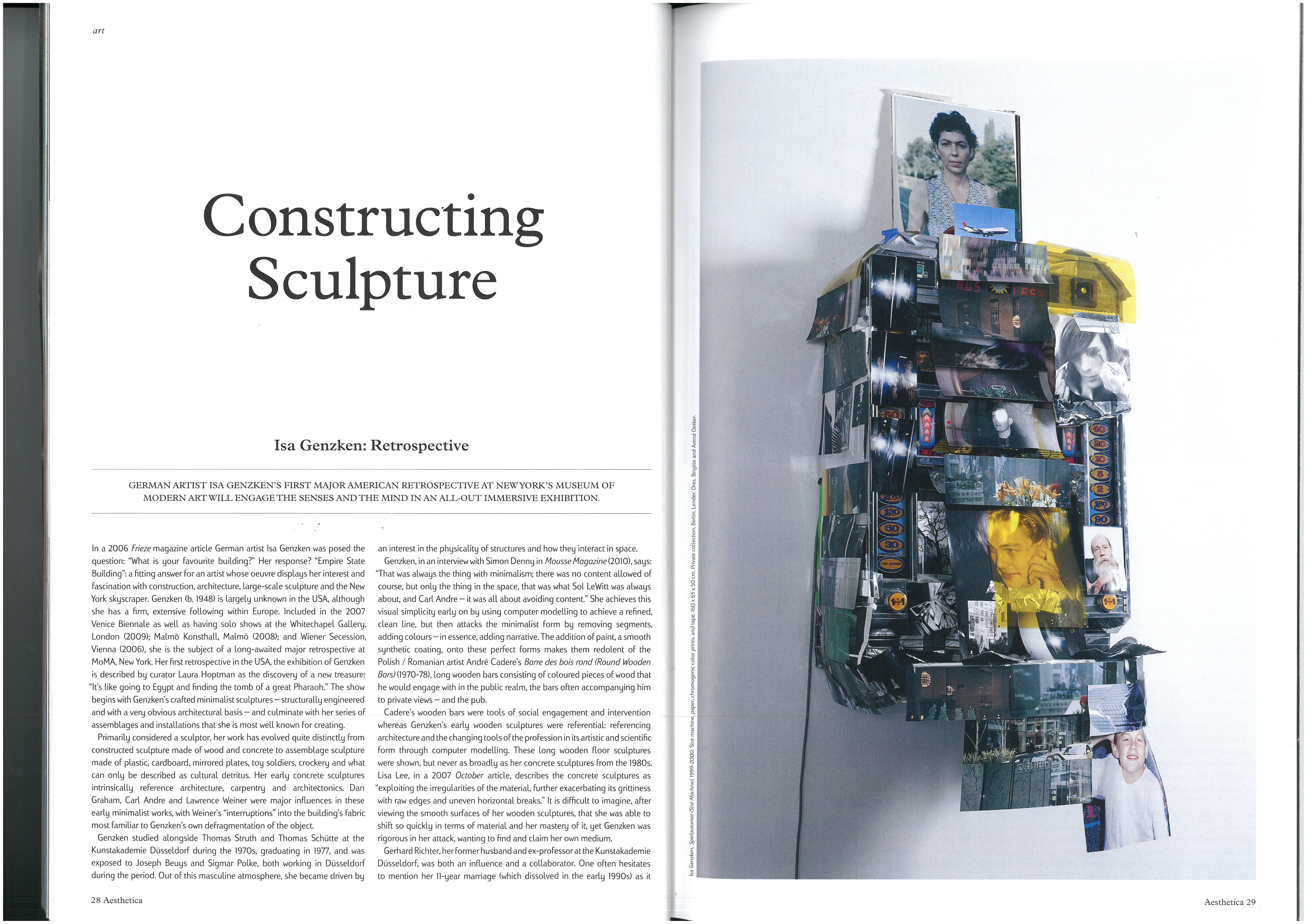
In Constructing Sculpture we have a simple establishing layout with text on one hand, full size portrait image on the other. Rather than bleeding the image to the edges of the page, Aesthetic have chosen to place a border around their image. This is something I discussed in a previous blog post about how I felt that a border allows an image to be placed within the design of the image as opposed to creating a division between left and right. Therefore I think this is a good example of how a portrait image can work nicely on a page.
By centring the headline, standfirst and the main body of text, Aesthetica lead you away from the news editorial or feature and place their ‘artistic’ stamp on the article, not through complexity but clarity and simplicity.
It is impressive how such a basic change in design can communicate a completely different message to the reader, showing how valid design is as its own visual language.
Of course, fine art is about letting the art speak for itself and so it is of no shock that the font Aesthetica have chosen for Constructing Sculpture is modest and nondescript.

The large indentation around the quote stands out to me to be a deliberate design that mirrors the bold structural content of the article.
I’m not sure I like how disruptive it is and would probably have chosen for it to be placed centrally between the top left image and the text, leaving more negative space on the page.
There is continuity in Aesthetica which I like. I think this is important for the branding of a magazine. As The 10 Commandments of Typography states:
Thou shalt not apply more than three typefaces in a document. Always remember that simpliciy reigns over the disarray and confusion that the use of many typefaces causes.
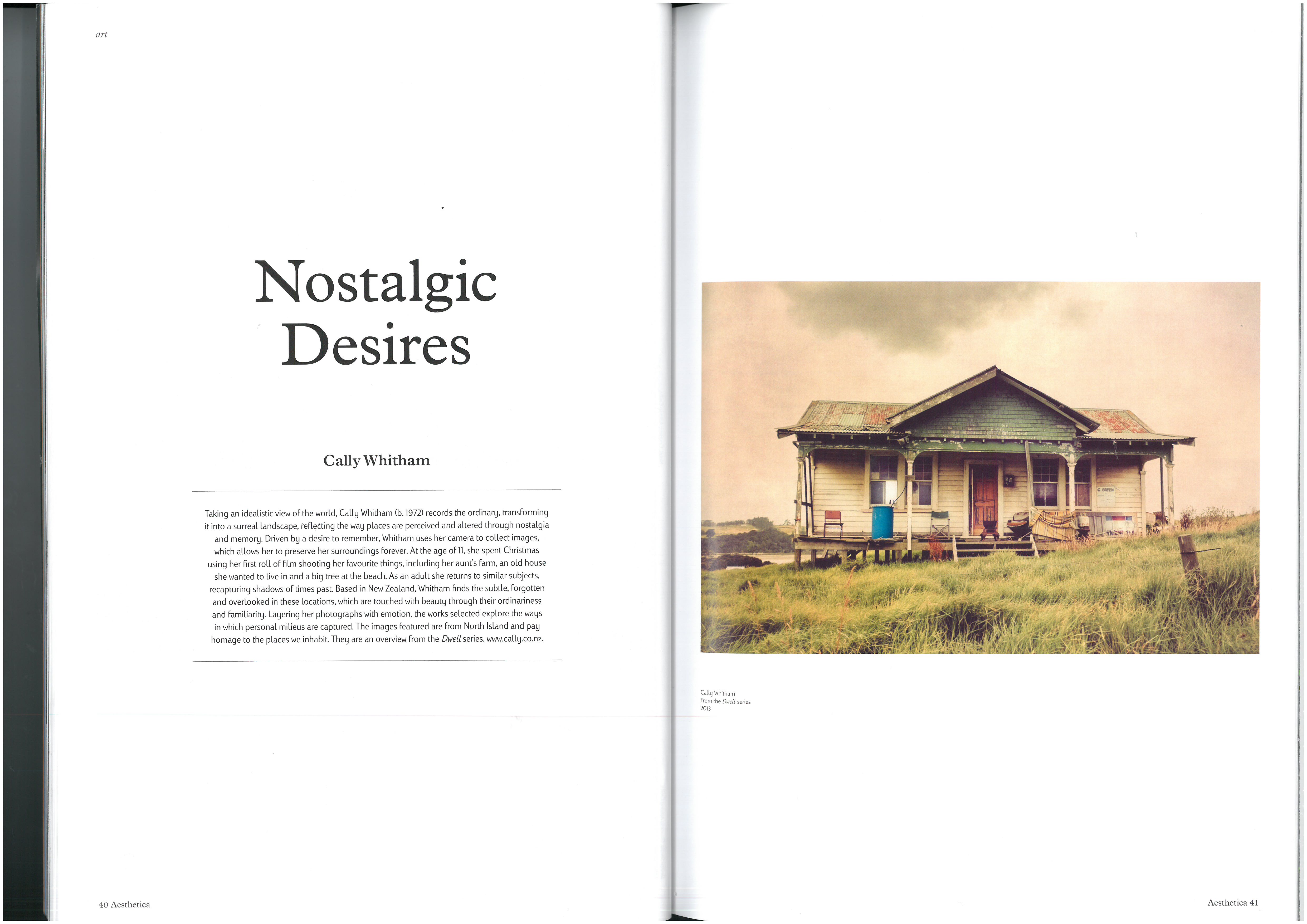
The conciseness of the single row of text, which is contained within lines on the page is quaint and lends itself more towards the idea of nostalgia. The images are then left alone on the page, as though it were a photograph album, reinforcing the idea.
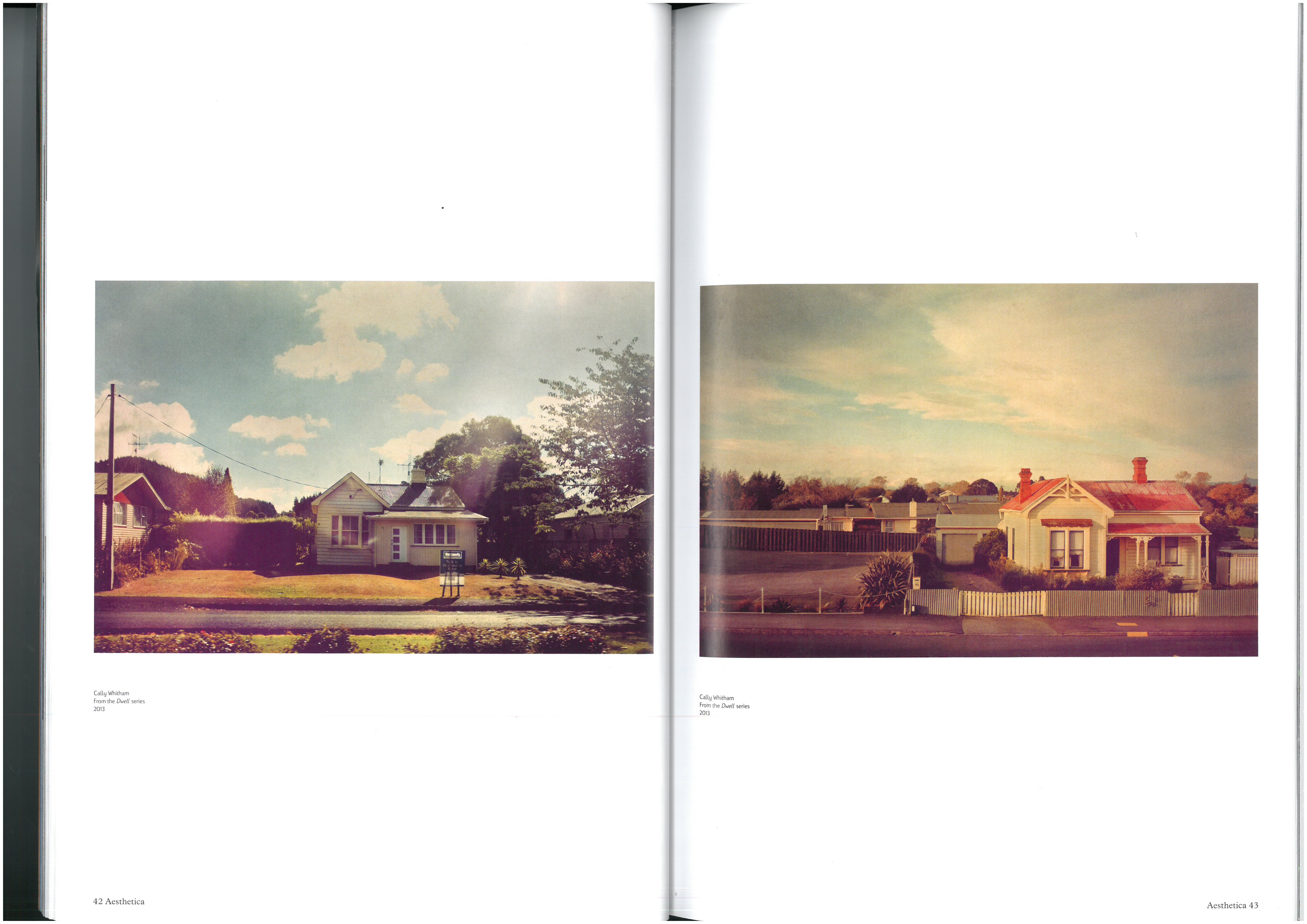
For a series of pictures where the subject repeats itself as well as the aesthetic, single pictures on a page without text is a good thing. It is more of a portfolio and only needs a small introduction.
However, for a photo journalistic story where the images are descriptive and tell a story, it is likely that the images need to be backed up by text.
I think what this has shown is how a designer can fashion a layout that helps to reinforce an idea, just as a photographer will choose to employ a yellow colour cast to his photographs for the feeling of nostalgia.