Tag Archives: storytelling

Peter & The Wolf for exhibition, No. 20s Wine Bar, Penryn. Now – May

Having talked in my last Peter & The Wolf post about liking the idea of sequencing the series of portraits for an exhibition space alongside the written narrative, I was given the opportunity about 5 minutes after writing out the blog post (!) by Celine from Cartel Photos, to submit one image based on the subject of ‘Movement’ for the new Cartel Photos exhibition (which is now up and running until May!).

It was great to be able to share my new idea with Celine, who was immediately on board and within three days it was up in the No. 20s Wine Bar alongside twenty other great pieces of very varied work across the Institute of Photography at Falmouth University.

It’s all still there so all you Falmouth/Penryn people, go see the work…over a glass of wine.

Peter and the Wolf, Prokofiev, Movement exhibition, February - May  2015

Tagged , , , , , , , , , , , ,

Peter and the Wolf portrait

Dad narrating Peter and the Wolf to the full orchestral music, The Photography Centre, Penryn Campus, 10th February 2015


Patrick Romer aka Dad. Photograph by Amy Romer © 2015 All rights reserved.

After a morning of some bog-standard portraits whilst we both warmed up into our roles as photographer and subject and followed by a well deserved coffee break, I thought it might be interesting to photograph something that Dad is currently doing, which is rehearsing as the narrator to the composition and children story, Peter and the Wolf.

We’d discussed the moral and ethics of the story in the pub the previous evening and having had a recent lecture in narrative, music and storytelling, I was keen to listen to Prokofiev’s classic orchestral narrative and thought it might be interesting to photograph Dad reading it as we listened to it through loud speakers on YouTube.

I came to realise that I was creating a narrative with each picture I took, told through my Dad’s expression. My idea is to make an edit of the portraits I took throughout the 30 minute composition and caption each with the part of the narrative Dad is reading. You could even have the music playing if it were in an exhibition space.

It’s a bit artsy for me but I can’t help but like the idea.


Tagged , , , , , , , , ,

Paul and Joshua featured on Cartel Photos homepage

Cartel Photos photographic agency have kindly featured my story Paul and Joshua on their homepage this month, in preparation for what should be an exciting start to a more interactive website that will encourage open discussion and involvement on topics that surround the medium of photography.

In a few weeks time, my homepage feature will include a sound byte, where I will be discussing my experiences, challenges and the specific issues I faced surrounding ‘access in photography’.

I will be looking at three projects from the last academic year: Paul and Joshua, Eileen (which is not yet published) and Longevity. These projects have been specifically chosen by myself and Cartel Photos as examples of where access has had a direct effect on the work I produce and on myself as a photographer.

The idea is that my discussion will encourage other photography students from Falmouth and dare I say it – from beyond those-there borders, to share their experiences with us so we can discuss the topic further, building on each others thoughts and pushing the topic to its absolute limits…

I will post when the discussion will be available. Watch this space and gather your thoughts people!!

_MG_0365

Tagged , , , , , ,

Sticking with Futura

I know I used Futura in the last design but I think this design is different enough in the content, design and how I shot for the spread that I don’t mind that I’ve used one of the same fonts. I just think I love how neutral and elegant it is, whilst not being too suggestive and giving the spreads a professional, modern finish. You can really do what you want with it as there are 20 versions of the font and each have a very different feel, which is why I think it works on different levels for different stories!


Tagged , , , , , , , , , , , ,

Decision Making

Having spoken to people who have been following this blog…(namely my Mum and my housemates), I’ve narrowed my decision down to these three designs.


Design 1

Image

I think Design 1 is likely to be the final submission because the text truly belongs on the picture. The font, colours, positioning and even how the text looks lit up from the natural light on the wall.


Design 2

Image

This was a favourite amongst people but I feel that the headline looks as though it has been placed there through default, as there is nowhere else for it to go, which is the truth. There needs to be more space between Joshua and the headline, and this is more evident when we can see the perfection of the above design.


Design 3

Image

I still can’t move away from this initial design although it was only my Mum that agreed with me. I just really like how the headline works alongside the images. However, it received criticism that when in context with a double page it might look too divided because of the headline having two bits to it and the pictures being quite different. It was also thought that the tattoo detail looks as though it belongs within the story but maybe not as an establishing shot, which I think is a valid point.


So all in all, I think it’s likely I’ll choose Design 1 but I’m going to print out all 3 in preparation for submission to see how it looks physically on paper.

Tagged , , , , , , , , , , , , , , , , , , , , , , , , , , ,

Design 7: Longing for Joshua

Image

I always thought this picture would work as an establishing shot as it shows a beautiful but quite an emotional moment between Paul and Joshua making it a strong picture but also descriptive. However I wanted to try and work with the others first as I knew I could do more with them in terms of design.

I’ve also tried to think of something different with the title by placing a strip of picture behind it and turning down the opacity – something very simple but potentially effective.

I like the design but somehow it has more of a feeling of being a film poster rather than the opening of a photographic picture story…I might be trying too hard when actually, simple is best!


Variation

Image

I thought I’d see how it worked on my original design. Using the picture from Design 5, I cropped it so that both faces were in the strip, which are then opposites of the two establishing shots above, emphasising the meaning of the headline.

Again, maybe this is too busy? Is it necessary to try and be clever like this and will the busy page just lose the attention of the reader?


Tagged , , , , , , , , , , , , , , , , , , , , , , , ,

Design 6: Longing for Joshua

Variation 1

Image

Once again keeping the same title, I’ve changed the establishing shot to one that I specifically shot in mind of using for the opening of an editorial. The long red wall gave me an obvious opportunity to shoot like this as Paul and Joshua played on the sofa not so long after we arrived at the flat.

In Design 6 Variation 1 I’ve kept the same design as Design 5 Variation 1, just replacing the image and changing the colour of the Futura font from black to white on the image so it stands out better and is another element I quite like!

I think I prefer this image as an establishing shot than Design 5 as it is more true to the reportage style of the story. Also I think the contrast between the playfulness of the picture and the more serious headline may make a reader wish to turn the page and find out what it’s about.


Variation 2

Image

I think this is the point where it’s obvious that this picture has been created specifically to be written on as it actually works so well with text over it. Saying that, I still really like Variation 1 and I’d say choosing between Variation 1 and Variation 2 would be a matter of personal taste.

In Variation 2 I’ve kept the same design as in Design 4 where I keep a strip of white along the top to place the title of the magazine and who the article is which I think works well as it means that there would be consistency throughout the editorial as well as looking aesthetically pleasing.


Variation 3

Image


This time I thought I’d see what it looked like with the title of the magazine over the top of the image. To me, it looks as though it doesn’t belong there and ruins the crispness of the design so it either needs to be Variation 2 or it needs to be taken away altogether.


Variation 4

Image


This does look much crisper but I’m not sure I agree with the idea of a page in a magazine not giving you any context as to what the magazine is, so I’m probably happier with Variation 2 in terms of placing headlines over images although I still really like Variation 1 where the headline is above the image.


Tagged , , , , , , , , , , , , , , , , , , , , , , , , , ,

Design 5: Longing for Joshua

Image

Keeping the same title, I have changed the establishing shot to one that may be more descriptive but that I can’t use as a full page bleed. This is a nice moment between father and son and works well as an establishing shot to open the story. We are introduced to both subjects and although the picture is a beautiful moment, we know from the headline that there is a story somewhere.

Possible faults: Maybe I’d like to see more of the picture in focus? I was working with really low light by this point and so I was using an aperture of f/1.4, (which is one of the reasons why I think the portrait of Josh on his own is so beautiful) but here I find despite thinking this is a lovely moment, I want more of the picture to be in focus and the fact that it isn’t makes it a little distracting.

Also, if I were to use this as an establishing image, it would rule of being able to use the following shot:

Image

…And I think this is a shot that can’t be missed out!


Variation 1

Image

Image

I’ve had my eye on spreads like this from Parallax Magazine on Behance that place text partly on the image. With unfussy out of focus parts of images like this I think it works well and stands out as being a little different.

I think it works well on the picture I’ve chosen and is a design I’d happily use.


Variation 2

Image


My Dad sent me a couple of ideas for headlines, Windows on Fatherhood being one of them. I had to phone him and ask him what it was referring to and he explained that it was the idea of the windows being the photographs, so ‘photographs of fatherhood’.

He really likes it and so do I but I’m not sure I want the attention to about the physical object of a photograph. Instead, I want people to  focus on making the story real for people.

So for this reason I think I’m going to stick with either Longing for Joshua or Me in You, You in Me.

Tagged , , , , , , , , , , , , , , , , , , , , , , , , , ,

Design 4: Longing for Joshua, full page bleed

Image

Whilst working with this shot on the establishing pages of designs 1-3 I was aware that there was enough space in this image to use it as a full bleed to place text over the top of it.

You may remember from my posts whilst researching editorials and designing Longevity that I was fairly against the idea of  placing text over the top of image. I find it’s often done badly and as a result is really distracting to both the image and the writing, making me as a ‘reader’ too aware of the design elements than of the story/image.

BUT…I need to give it a go and I did shoot certain shots with this in mind to see if I could achieve a design that was a little more out of my comfort zone in terms of aesthetics and design.

In fact, placing the text over the top of this image does not bother me at all and I think it works really nicely.

Never Lazy Magazine, ISSUU

Below is a similar head and shoulders portrait that has been used as the establisher to a photo story. In this example, I find that the headline kissing his face and quote that overlaps his shoulders is distracting, despite the portrait being decent.

Screen shot 2014-02-24 at 12.39.07

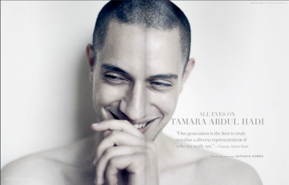
What I do like is how the headline mirrors the tones of the picture, so I’ve tried some for my own:


Screen Shot 2014-06-28 at 15.42.55 Screen Shot 2014-06-28 at 15.50.48


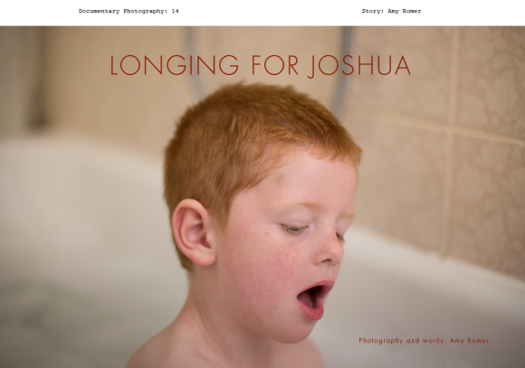
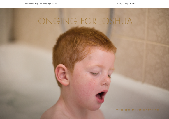
Although the colour below looks more fitting with the tones of the picture, ‘Photography and words: Amy Romer’ gets a little lost in the picture. Looking back at the black headline, it certainly looks more defined and jumps out at you more than this.


I left the title of the magazine at the top as I like the design element but also because there isn’t enough room at the top of the image to place it within the frame.

The problem I faced when designing this was thinking up a headline that made up for the absence of Paul because this picture alone does not really tell us too much about the story. The headline therefore needed to be descriptive.

I’m still unsure as to whether this is enough to lead someone into the story. I think the picture is strong but I wonder if there are too many questions without Paul in the frame? Or maybe the focus on Joshua is a good thing and it’s as though the viewer is looking from the eyes of Paul?

I think it’s something I’m going to get some opinions on before deciding.

Tagged , , , , , , , , , , , , , , , , , , , , , , , , , , , ,

Design 3: Two Establishing Shots

Image

A minor change from Design 2 as this time I have joined up the two images in the central gutter. I think for the establishing page it could be a good thing to do as these two pictures stand for one thing. They are not two separate elements to the story and neither are they the beginning of the narrative; they just act as a collective summary.

Image


I’ve tried to see how the story works if I limit the amount of pictures within it. Below are the pictures I took out:

_MG_0394 _MG_0213

I took these two pictures out as they don’t contribute to the story as such. However, having taken them out and looking at the four that remain, I do think they contribute to the overall story about the relationship between Paul and Joshua. They are the quieter moments, which can be as important as the ‘doing’ moments.


Tagged , , , , , , , , , , , , , , , , , , , , , , , , , , , ,