Tag Archives: Press & Editorial Photography

Peter & The Wolf for exhibition, No. 20s Wine Bar, Penryn. Now – May

Having talked in my last Peter & The Wolf post about liking the idea of sequencing the series of portraits for an exhibition space alongside the written narrative, I was given the opportunity about 5 minutes after writing out the blog post (!) by Celine from Cartel Photos, to submit one image based on the subject of ‘Movement’ for the new Cartel Photos exhibition (which is now up and running until May!).

It was great to be able to share my new idea with Celine, who was immediately on board and within three days it was up in the No. 20s Wine Bar alongside twenty other great pieces of very varied work across the Institute of Photography at Falmouth University.

It’s all still there so all you Falmouth/Penryn people, go see the work…over a glass of wine.

Peter and the Wolf, Prokofiev, Movement exhibition, February - May  2015

Tagged , , , , , , , , , , , ,

Peter and the Wolf portrait

Dad narrating Peter and the Wolf to the full orchestral music, The Photography Centre, Penryn Campus, 10th February 2015


Patrick Romer aka Dad. Photograph by Amy Romer © 2015 All rights reserved.

After a morning of some bog-standard portraits whilst we both warmed up into our roles as photographer and subject and followed by a well deserved coffee break, I thought it might be interesting to photograph something that Dad is currently doing, which is rehearsing as the narrator to the composition and children story, Peter and the Wolf.

We’d discussed the moral and ethics of the story in the pub the previous evening and having had a recent lecture in narrative, music and storytelling, I was keen to listen to Prokofiev’s classic orchestral narrative and thought it might be interesting to photograph Dad reading it as we listened to it through loud speakers on YouTube.

I came to realise that I was creating a narrative with each picture I took, told through my Dad’s expression. My idea is to make an edit of the portraits I took throughout the 30 minute composition and caption each with the part of the narrative Dad is reading. You could even have the music playing if it were in an exhibition space.

It’s a bit artsy for me but I can’t help but like the idea.


Tagged , , , , , , , , ,

Assisting Jane Hilton’s winter fashion shoot for Next and how it helped with my own photography

I recently received Next’s Winter and Christmas catalogue in the post, which at first I thought was odd as it’s definitely not something I’d sign up to but soon realised that it would be the calalogue that featured Jane’s shoots I assisted over summer.

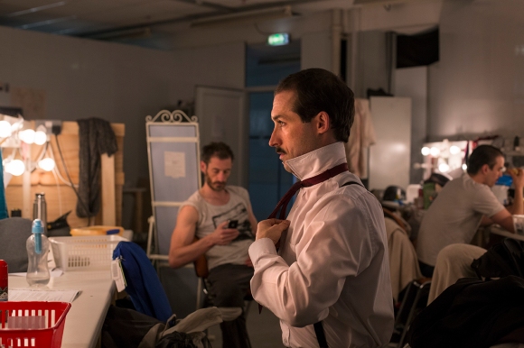
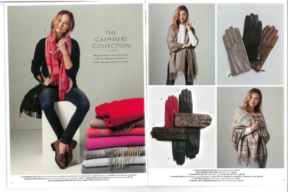
I quickly flipped through and instantly found Heloise Guerin outside St. Paul’s Cathedral and even found my own shadow as I shaded her from the heat of the scorching July morning.

It was the challenges we faced at St. Paul’s where I felt I’d really benefitted from the breadth of knowledge and experience from Jane and her team. Jane apologised for the 6am start but she knew that by 9am, we’d be swamped with tourists and it would be increasingly difficult to shoot. This way, we’d also gain from the morning sun, although we were still shooting up until 4pm because of the difficulties of location shoots – living out of a parked Winnebago whilst scouting for different places to shoot that will avoid the Japanese wedding photographers that seem to be scattered across St. Paul’s shooting rich Japanese engaged couples outside famous tourist attractions in wedding gear bought specifically for the shoot and not worn on their wedding day…(Jane’s curiosity couldn’t help but ask them what they were up to). This along with the normal hold-ups of garment changes, make-up retouching,  etc etc certainly introduced me head first into the world of fashion.

These shoots take an incredible amount of organisation – car passes, parking spaces, drivers, location rights, models, make-up, hair, tethering, equipment, assisting, designing, directing, breakfast and lunch supplies…oh and photographing.  Fashion is certainly a team effort and is incredibly involved.

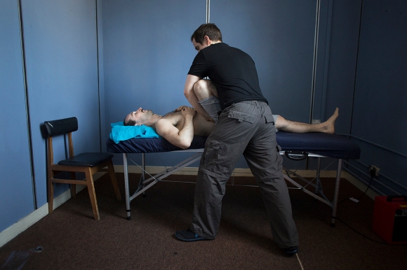
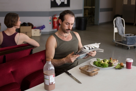
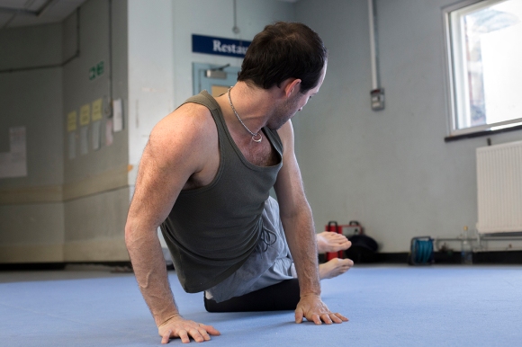
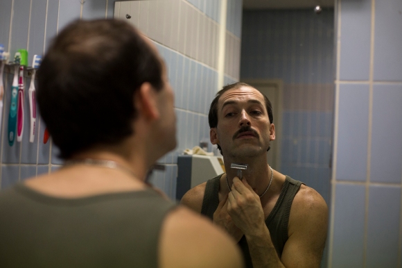
I don’t think I was really aware of how much I took away from the experience until I had to shoot my first fashion shoot two days ago, which I had really not been looking forward to as a documentary photographer. https://amyromer.wordpress.com/2014/10/27/fashion-shoot/ I instinctively wanted to plan the shoot with Jeff (my model) beforehand, showing him pictures of ideas I had so we could collaborate based on both our experiences. I knew my model would be more experienced than I was as a photographer so their input was hugely important to me. I arranged to be on location at 7am so I had time to scout for a specific spot and arranged for my model to meet us at 8am, so he wasn’t hanging around unnecessarily.  I had every piece of equipment I felt could potentially be needed and my model was in charge of the clothes he wanted to model – a weight gladly taken off my mind. We worked with two assistants and knew exactly where we were going for breakfast after the shoot! Job done and home to Falmouth by 10:30am. I know that without assisting Jane, there would have been several essential elements missing – the most important element being confidence in what I was doing.

A few shots from my first fashion shoot:


Fashion with Jeff MonkmanFashion with Jeff MonkmanFashion with Jeff Monkman

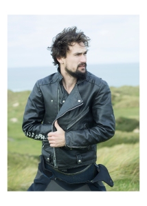
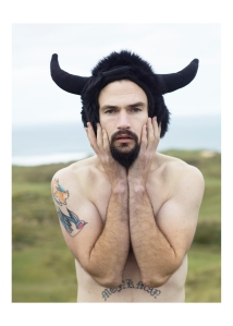
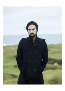
All rights reserved © Amy Romer 2014

So thanks Jane Hilton for allowing me to enjoy fashion.

Screen Shot 2014-10-28 at 15.57.31 Screen Shot 2014-10-28 at 15.57.41 Screen Shot 2014-10-28 at 15.57.54 Screen Shot 2014-10-28 at 15.58.03 Screen Shot 2014-10-28 at 15.58.13

All rights reserved © Jane Hilton 2014

…spot my shadow??

Tagged , , , , , , , , , , , , ,

Adam Burton in preparation for his role as Mr. Stanford in The Drowned Man: A Hollywood Fable by Punchdrunk Theatre and in association with The National Theatre, The Old Paddington Post Office, London, 3rd July 2014

An Actor Prepares

Once a week, Adam Burton receives physiotherapy and acupuncture treatment from the company’s own therapist to treat a groin and knee injury, both of which occured during performances of The Drowned Man.

An Actor Prepares

Adam Burton eats his dinner of chicken thigh, avocado and salad leaves with one litre of chocolate milk in preparation for the evening show.

An Actor Prepares

Before each show, Adam Burton completes his warm-up routine in preparation for the physically demanding role he plays as Mr. Stanford.

An Actor Prepares

Adam Burton shaving for his role as Mr. Stanford.

An Actor Prepares

Adam Burton changing into costume in the mens dressing room.

_MG_9993blog

Adam walks through the audience prepared building where he will begin his role as Mr. Stanford.

An Actor Prepares


Adam Burton sits and waits for the first members of the audience to arrive into the room where he will begin his role as Mr. Stanford in The Drowned Man: A Hollywood Fable by  Punchdrunk Theatre, The Old Paddington Post Office, London, 3rd July 2014

Tagged , , , , , , , , , , , , , , , , , , , , , , , , ,

Sticking with Futura

I know I used Futura in the last design but I think this design is different enough in the content, design and how I shot for the spread that I don’t mind that I’ve used one of the same fonts. I just think I love how neutral and elegant it is, whilst not being too suggestive and giving the spreads a professional, modern finish. You can really do what you want with it as there are 20 versions of the font and each have a very different feel, which is why I think it works on different levels for different stories!


Tagged , , , , , , , , , , , ,

The second page

How will my choice of establishing page affect the edit? 

Image

Image


If I am to choose this layout I have to sacrifice the following:

Image

I don’t particularly want to lose this picture but I don’t think I can use it alongside the establishing shot. The scene is too similar despite being at different times of day. I think it’s unfortunately worth losing this in the edit in order to have the establishing shot as it is.

Image

Image

My original edit. I think these moments are more interesting and tell more of a story than the narrative of a typical day for Paul and Joshua, which is how I edited some of the layouts in previous blog posts. Words can easily describe the simpler pictures I’ve missed out but I think it’s pictures like some of these that give photography it’s place in art and storytelling, as words fail to describe easily these moments in our lives.

Second page design alternative

Image


I think having six pictures that are all the same rectangular format limits the design as I don’t want to crop my images. I know in reality they might be cropped but I don’t really see a need and barely an opportunity so I’m happy to leave them.

I think between this and the original design, I prefer the original. The pictures need space between them as they work well in threes: the top being the activities and the bottom being at home.

Tagged , , , , , , , , , , , , , , , , , , , , , , , , , , , ,

Decision Making

Having spoken to people who have been following this blog…(namely my Mum and my housemates), I’ve narrowed my decision down to these three designs.


Design 1

Image

I think Design 1 is likely to be the final submission because the text truly belongs on the picture. The font, colours, positioning and even how the text looks lit up from the natural light on the wall.


Design 2

Image

This was a favourite amongst people but I feel that the headline looks as though it has been placed there through default, as there is nowhere else for it to go, which is the truth. There needs to be more space between Joshua and the headline, and this is more evident when we can see the perfection of the above design.


Design 3

Image

I still can’t move away from this initial design although it was only my Mum that agreed with me. I just really like how the headline works alongside the images. However, it received criticism that when in context with a double page it might look too divided because of the headline having two bits to it and the pictures being quite different. It was also thought that the tattoo detail looks as though it belongs within the story but maybe not as an establishing shot, which I think is a valid point.


So all in all, I think it’s likely I’ll choose Design 1 but I’m going to print out all 3 in preparation for submission to see how it looks physically on paper.

Tagged , , , , , , , , , , , , , , , , , , , , , , , , , , ,