amyromer
Photographs and words
Tag Archives: london
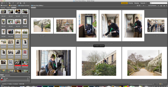
More from the edit: Green Party canvassing for the 2015 general election at Whittington Estate, Highgate and Walker House, Somers Town
The more I look the more I see. An obvious thing to say but as a photographer, it can be hard to see – particularly when you don’t know what you’re looking for.
This work has varying purposes. Firstly, it is a university project which is an open brief that I am creating as I go along.
Secondly, it is work that can be used by The Green Party for promotion, their website, social media, etc.
Thirdly, the nature of the subject matter and the fact that the general election is just around the corner, means that I’m now wondering who and where might publish my work.
On reflection of the weekend, I definitely found myself being pulled in various directions to please and meet the needs of others, which I think clouded my vision as a student trying to do a mini-feature on canvassing in London (which was the unofficial brief I’d written for myself for the weekend).
However, I think what I’ve got out of the weekend is something different to what I’d set out for, and is certainly not worse than what I’d planned. It’s just less prescribed and less linear.
It’s long-form story telling. And it will require more shoots with an open mind and eyes wide open.
I have to say it’s surprisingly relieving to not know what you’re looking for.
All images Amy Romer © 2015. All rights reserved.
Editing. Printing. More editing.
I love big screens and Adobe Bridge but there isn’t anything quite like moving things around on an actual table.
And sadly, I’m very excited about doing this.
I’ll be posting more from The Green Party edit tomorrow. It’s fun how everyday your eye seems to see something different. It might be that something you thought was good is actually crap, or that a picture you previously dismissed has somehow come alive.
Londoners (or anybody willing to travel) – Please support our second year BA(Hons) Press & Editorial Photography exhibition The Long & Short of it. Exhibiting at Calumet, London, 24th March – 17th April. Private View 24th March. Lots of up-and-coming talent, plus free food and booze. I shall be there with canapés…
Tagged 2nd Year exhibition, Art, booze, Calumet, Cartel, Cornwall, documentary, exhibition, fashion, Fujifilm, london, news, photography, Portraiture, Press & Editorial Photography, Private View, reportage, sport, studentAdam Burton in preparation for his role as Mr. Stanford in The Drowned Man: A Hollywood Fable by Punchdrunk Theatre and in association with The National Theatre, The Old Paddington Post Office, London, 3rd July 2014

Once a week, Adam Burton receives physiotherapy and acupuncture treatment from the company’s own therapist to treat a groin and knee injury, both of which occured during performances of The Drowned Man.

Adam Burton eats his dinner of chicken thigh, avocado and salad leaves with one litre of chocolate milk in preparation for the evening show.

Before each show, Adam Burton completes his warm-up routine in preparation for the physically demanding role he plays as Mr. Stanford.

Adam Burton shaving for his role as Mr. Stanford.

Adam Burton changing into costume in the mens dressing room.
Adam walks through the audience prepared building where he will begin his role as Mr. Stanford.
Adam Burton sits and waits for the first members of the audience to arrive into the room where he will begin his role as Mr. Stanford in The Drowned Man: A Hollywood Fable by Punchdrunk Theatre, The Old Paddington Post Office, London, 3rd July 2014
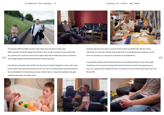
First draft of double page spread
The content
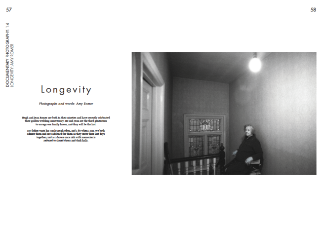
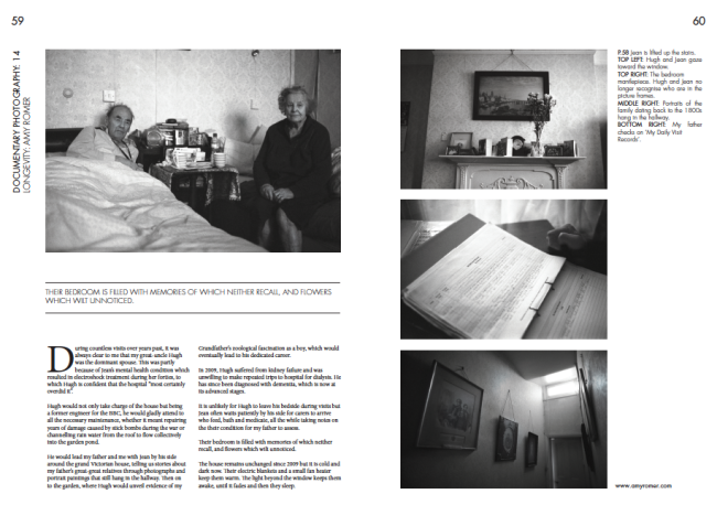
As discussed on March 1st in the article ‘Choosing a Story’, I think of the five images selected for the story, Jean on the stairs has to be the establisher. It’s a visually striking picture that entices you into the story. The second most important is Hugh and Jean on the bed as it introduces you to the couple and their bedridden existence. The other three are important in terms of telling the story but are more detailed shots, which are talked about within the text.
I wrote this story back in December for an issue of 205dpi magazine and have found myself editing it slightly, partly through criticism of my own writing but partly because I hadn’t really explained who I was in relation to Hugh and Jean and hadn’t made it clear enough what was going on in some of the detail pictures.
Originally, this story was called ‘Mortlake Road’ but I have tried to be less objective and more suggestive and elegant with my choice of word(s) for the headline. ‘Longevity’ seems the perfect description for Hugh and Jean and I have tried to use design to mimic this by loosening the tracking.
I will need to play around with Figures. I can either direct you to the pictures within the main body of text ie (top left), or I can create a design element for them. The space on the far right could work well for this although I’m enjoying the negative space I’ve created in that column.
The design
This design is based on a selection of elements I found myself being particularly drawn to during my editorial design research. My aim is to produce two double page spreads that borrows these elements to create a clear vision for my work that can communicate the story clearly whilst looking attractive on the page.
You can see here that I like the design to be simple and minimalist with plenty of negative space, simple type faces and clean shapes. Whilst designing, I found myself being very aware not to create a design element purely for the sake of design, but to make sure that it had a benefit to the story or to the editorial itself. For example, I have named the editorial ‘Documentary Photography’ (invention clearly not my forte), and have given it an Issue number. This is something you would find in any art editorial and allows me to think about design. However, when I started placing elements such as lines around the design, most of the time I deleted them as they seemed to have no purpose and distracted me from the content.
As I seemed to be drawn to the establishing image leaking itself across onto two pages, I have started with this design. It gives a clear area for the headline and standfirst, it looks crisp and I don’t have to worry about the issues faced when placing text over the top of an image.
The lines around the quote I think help the quote stand out and are therefore justified. They also look aesthetically pleasing as the lines match the thickness of the crisp capitals of Futura Light.
Having assessed editorials to look at how many typefaces they use on average, I found that generally editorials use no more than three typefaces. Often, they use two but will use a few various typefaces from their font family, as opposed to using different fonts altogether. In my design, I have used three fonts: Lixus Libertine and Minion Pro for the main body text and standfirst and Futura for the other elements.
I particularly wanted to link the headline to the title of the editorial, page numbers, website etc because it tightens up the editorial gives it a stronger brand (were it real) and I used Futura for this because it seems to be a versatile font that is crisp and modern but classic at the same time.
A note of Futura:
Following the Bauhaus design philosophy, German type designer Paul Renner first created Futura between 1924 and 1926. Although Renner was not a member of the Bauhaus, he shared many of its views, believing that a modern typeface should express modern models rather than be a rivial of a previous design. Futura was commercially released in 1927, commissioned by the Bauer type foundry.
While designing Futura, Renner avoided creating any non-essential elements, making use of basic geometric proportions with no serifs or frills. Futura’s crisp, clean forms reflect the appearance of efficiency and forwardness even today.
http://idsgn.org/posts/know-your-type-futura/
It is interesting to see that I seem to have chosen a typeface that mimics what I’ve been saying about avoiding ‘non-essential elements’ with its efficient, crisp appearance.
Next I will be showing various versions of this design. The changes are subtle but nevertheless important!
All images © Amy Romer 2014


