Tag Archives: kew gardens

Final Spreads!

Final Submission:

Image

Image

When writing the piece I realised that the tattoo was an important element of the story and so I had to make a decision as to where it would go and what I would take out as I think 7 images would be too busy on the page.

I decided to take the picture of Josh looking up at his Dad in the living room because Josh in the bath looking up at his Dad represents the same thing.

I considered taking out the top middle picture with the red walls in the background because I felt it was in danger of being too similar to the establishing page but I decided that the content was different enough and the unconcious mirroring of Paul and Joshua on the sofa was important. Also, they aren’t on the same page so having a similarity like that in’t really too much of an issue.

ImageImage


Tagged , , , , , , , , , , , , , , , , , , , , , , , , , , , , , , , ,

First draft of double page spread

Screen shot 2014-05-15 at 14.19.07

Screen shot 2014-05-15 at 14.16.47


The content

As discussed on March 1st in the article ‘Choosing a Story’, I think of the five images selected for the story, Jean on the stairs has to be the establisher. It’s a visually striking picture that entices you into the story. The second most important is Hugh and Jean on the bed as it introduces you to the couple and their bedridden existence. The other three are important in terms of telling the story but are more detailed shots, which are talked about within the text.

I wrote this story back in December for an issue of 205dpi magazine and have found myself editing it slightly, partly through criticism of my own writing but partly because I hadn’t really explained who I was in relation to Hugh and Jean and hadn’t made it clear enough what was going on in some of the detail pictures.

Originally, this story was called ‘Mortlake Road’ but I have tried to be less objective and more suggestive and elegant with my choice of word(s) for the headline. ‘Longevity’ seems the perfect description for Hugh and Jean and I have tried to use design to mimic this by loosening the tracking.

I will need to play around with Figures. I can either direct you to the pictures within the main body of text ie (top left), or I can create a design element for them. The space on the far right could work well for this although I’m enjoying the negative space I’ve created in that column.


The design

This design is based on a selection of elements I found myself being particularly drawn to during my editorial design research. My aim is to produce two double page spreads that borrows these elements to create a clear vision for my work that can communicate the story clearly whilst looking attractive on the page.

You can see here that I like the design to be simple and minimalist with plenty of negative space, simple type faces and clean shapes. Whilst designing, I found myself being very aware not to create a design element purely for the sake of design, but to make sure that it had a benefit to the story or to the editorial itself. For example, I have named the editorial ‘Documentary Photography’ (invention clearly not my forte), and have given it an Issue number. This is something you would find in any art editorial and allows me to think about design. However, when I started placing elements such as lines around the design, most of the time I deleted them as they seemed to have no purpose and distracted me from the content.

As I seemed to be drawn to the establishing image leaking itself across onto two pages, I have started with this design. It gives a clear area for the headline and standfirst, it looks crisp and I don’t have to worry about the issues faced when placing text over the top of an image.

The lines around the quote I think help the quote stand out and are therefore justified. They also look aesthetically pleasing as the lines match the thickness of the crisp capitals of Futura Light.

Having assessed editorials to look at how many typefaces they use on average, I found that generally editorials use no more than three typefaces. Often, they use two but will use a few various typefaces from their font family, as opposed to using different fonts altogether. In my design, I have used three fonts: Lixus Libertine and Minion Pro for the main body text and standfirst and Futura for the other elements.

I particularly wanted to link the headline to the title of the editorial, page numbers, website etc because it tightens up the editorial gives it a stronger brand (were it real) and I used Futura for this because it seems to be a versatile font that is crisp and modern but classic at the same time.

A note of Futura:

Following the Bauhaus design philosophy, German type designer Paul Renner first created Futura between 1924 and 1926. Although Renner was not a member of the Bauhaus, he shared many of its views, believing that a modern typeface should express modern models rather than be a rivial of a previous design. Futura was commercially released in 1927, commissioned by the Bauer type foundry.

While designing Futura, Renner avoided creating any non-essential elements, making use of basic geometric proportions with no serifs or frills. Futura’s crisp, clean forms reflect the appearance of efficiency and forwardness even today.

http://idsgn.org/posts/know-your-type-futura/

It is interesting to see that I seem to have chosen a typeface that mimics what I’ve been saying about avoiding ‘non-essential elements’ with its efficient, crisp appearance.


Next I will be showing various versions of this design. The changes are subtle but nevertheless important!


All images © Amy Romer 2014

Tagged , , , , , , , , , , , , , , , , , , , , , , , , , , , , , , , ,

Scanning professionally and the digital darkroom

Using 35mm negatives digitally requires a high resolution scanning facility and the ability to understand how to scan non-destructively in order to retain as much information from the negative as possible.

Using the Epson Perfection V750 Pro with 35mm inserts, I will take you through each step of scanning, followed by all the important elements of using Photoshop CS6 as a digital darkroom.

Using Professional Mode

Screen Shot 2014-03-03 at 11.15.29

Firstly, it’s important to check that you are working in Professional Mode, as unlike any of the other default settings, it allows you to work with negatives, providing options such as film type, high quality resolutions of up to 12800 dpi and bit-depth. You can also make adjustments, although it is advised to not make any adjustments that will lessen the quality of the negative. Adjustments are better applied at the later stages of Photoshop.

Document Type – In this case the document type is ‘Film (with film holder)’ as I have inserted my negatives into 35mm film inserts.

The Film Type –  This is self-explanatory and you choose from ‘B&W Negative Film’, ‘Colour Negative Film’ and ‘Positive Film’.

Image Type – When we say ’16-bit’ we are referring to the image’s ‘bit depth’, which is the maximum number of levels per channel that can be contained in a photograph. For example, a 24-bit RGB colour image is made up of three 8-bit image channels, where each 8-bit channel can contain up to 256 level of tone.

So by selecting a high bit depth to scan, more information is being embedded within the image. This means that when you come to dodge and burn in your digital darkroom, Photoshop will be able to use the extra information from the bit depth to adjust for you, rather than guessing information for you and destructing the quality and accuracy of the image.

You will notice on the Image Type drop-down that there is an option to select ’24-bit Colour’, which from my experience gives black and white negative scans a slightly inaccurate green tinge. I know professionals that would disagree but personally, I prefer to use 16-bit Grayscale for my black and white scans and 24-bit Colour for my colour scans.

Resolution – Although there is the option to scan up to 12800 dpi, this particular scanner will only be able to scan quality up to 6400 dpi. The reason I have chosen to scan at 3200 dpi is because for the purpose of this project, 3200 dpi is plenty sufficient. It also saves on time as high resolution scans will require much more time than low resolution scans and there is a big difference in time between 3200 and 6400 dpi without any sufficient visual difference in quality.

 Document size – For the preview the document size should be left to the scan areas full size. When selecting a negative to scan from the preview, you can either edit the document size to the size of a 35mm negative, which is 35mm x 24mm but I personally like to use the marquee tool to the left of the preview to select a slightly larger area than the 35mm negative to ensure I haven’t cropped my negative on any side.

Target size and Adjustments: Target size should be left as ‘Original’ and it is important to make sure that Unsharp Mask is deselected as the Epson software often voluntarily ticks this box without your permission and this is ultimately destruct the image quality.

The only adjustment I would make is slightly broadening the highlights and shadows on the histogram by clicking on the histogram icon and pulling the correct triangles outward. This way you will gain even more tonal range in your scan.

When your marquee has been selected and all of the above settings have been considered and applied, you are ready to scan.

Note: when scanning for a preview, 300 dpi is sufficient, and much faster. Previews are only beneficial to your selection process, so quality at this stage is not important.

Screen Shot 2014-03-03 at 11.16.35

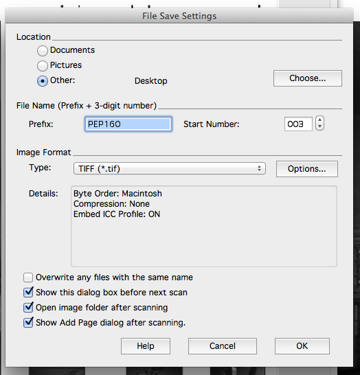
After clicking ‘Scan’, Epson will take you to this screen. The main thing to remember is to save the scan as a TIFF file.

A TIFF file is the industry standard format for archive work and publishing. TIFF files can and should be treated as uncompressed files and are compatible with both 8-bits and 16-bits per channel, unlike JPEG, which are only compatible with 8-bits per channel.


Photoshop CS6 as a digital darkroom

Screen Shot 2014-03-03 at 12.15.15

Before starting anything, it’s important to know what your looking at. Although it is arguably best to work in Adobe RGB (1998), it is important to remember what your output is. In this case, I will be printing the image using CMYK, so I want to view the image as CMYK, so I know exactly what it will look like, despite working on it using Adobe RGB (1998) via Colour Settings and Image Mode.

Screen shot 2014-04-12 at 22.09.39

Before editing, make sure you make a Background copy so that there i always the untampered original to fall back on, should you need it.

To dodge and burn non-destructively, make a new layer by holding option>shift whilst selecting the new layer icon on the bottom of the panels. This gives you the opportunity to select a Blending Mode  and in this instance I have chosen Overlay with 50% grey.

For areas that are too dark to dodge or too light to burn effectively, you can use Curves with the hand tool to select the local area you want to lighten or darken. Drag the hand up to lighten and down to darken until that area is how you want it to look. Don’t be put off that the whole of the image is darkening or lightening as you will then put a lid on it (so to speak) by using command>i. Now select the paintbrush tool and make sure the colour you are using is white  (reveals) and not black (hides). You can now use your paintbrush to reveal the area you want to dodge or burn.

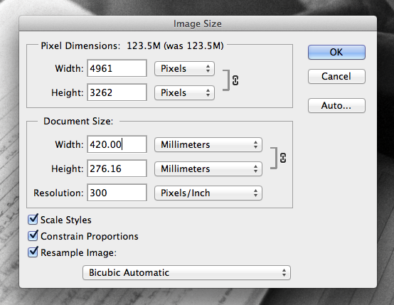
At this point, I don’t want to crop my image but I know that a full size A3 is 420mm x 297mm so I resize the image t 420mm on the longest side and leave the shorter side at 276mm. I’m not sure whether I need to lessen the pixel dimensions at this stage so I will leave that for a later date.

Screen Shot 2014-03-03 at 14.05.48

Once I am completely happy with all post-processing, I flatten the image reducing its size, and save it once again as a TIFF.

Tagged , , , , , , , , , , , , , , , ,

Alternative stories

Although I’m fairly certain I want to use Mortlake Road, these are the other two stories I could potentially use for an editorial spread.

ImageImageImageImageImage

Although I really like all these images separately, they do not link together to form a picture story.

This is from a brief called ‘A Person At Work’, where we were to summarise the title of the brief in one picture. I followed Liam, who is part of the Bennett’s family that own and run Chy-An-Besow Farm, a free-range chicken and rare breed pig farm in West Cornwall.

Liam takes part in the daily running of the farm and so I photographed him during various activities, which does not necessarily form a coherent story for an editorial.

It is possible that I could make a tight edit and only use the photographs of Liam with the chickens and form a story around the free-range element of the farm, but I can’t see how these images will form the story I’d want to tell.

ImageImageImageImage

For the same brief – ‘A Person At Work’, I photographed Garry Johnson, an artist blacksmith in East Cornwall. Although I was still shooting for the one picture, I managed to unconsciously create a picture story on Garry and his work.

This shoot took place after Chy-an-Besow and so maybe I was more conscious of moving in close, stepping back and creating more options for myself. I think also because we were in a small workshop, I had more time to think about the different ways of photographing rather than dealing with different scenes and photographing each scene in a few minutes.

I always knew that I couldn’t use the formal portrait but it was a picture I had to take because as he was talking to me the light became diffused and suddenly fell on his face really beautifully so it was an opportunity not to be missed.

Together, the pictures form all the elements to make a portraiture photo story suitable for an editorial format. The formal, the observed, the detail and the environmental.

I think my reservation lies in the story itself. I’m not sure how much I really have to say about artist blacksmithing, in comparison to what I have to say about Mortlake Road, which is a private family story about life-long love and the effects of dementia.

If possible, I think I’d like to do an editorial spread for both Garry Johnson and Mortlake Road. I think it would be interesting to see how I direct the two stories and deal with design, writing and editing.

All images © Amy Romer 2014


Tagged , , , , , , , , , , , , , , , , , , , , , , , , , ,

Scanning saves the day – extras from Mortlake Road, Kew

Image

Mortlake Road, Kew continues. In preparation for the project being featured in Issuu’s 205dpi December Issue.

I was unable to print these images because of some alien marks on my negatives! Likely to be caused during some stage of processing.

These small cabinets are dotted around the entire house. On them sit photographs of late family members. This is my Grandfather John Romer, the founder and former chairman of the Hong Kong Natural History Society. He also grew up in Mortlake Road. In the garden, the remains of animal enclosures he made as a boy can still be found.

Image

My father inspects the ‘My Daily Visit Records’ left by the care worker. Here, she writes what Hugh and Jean have eaten through the day and any activity they have undertaken.

All images © Amy Romer 2013

Tagged , , , , , , , , , , , , , , , , , ,

Mortlake Road, Kew

Since the early 1900s, Mortlake Road has been occupied by generations of my family. Over the years, I have listened to stories that centre around the family house. Although I am able to interpret these stories using my knowledge of the house and my imagination, these stories are no longer rememberd by the story teller – my Great Uncle Hugh, who is now suffering from dementia alongside his wife, my Great Auntie Jean.

Mortlake Road, Kew Gardens

They listen as my Father plays them a dictaphone recording of themselves in 2007 talking about the history of the house and their early relationship.

Mortlake Road, Kew Gardens

Portraits of each generation align the upstairs hallway that lead through to what Hugh once used as a study.

Mortlake Road, Kew Gardens

Jean climbing the stairs towards her bedroom.

hugh and jean004

The bedroom.


All images © Amy Romer, 2013

Tagged , , , , , , , , , , , , , , ,