Tag Archives: digital

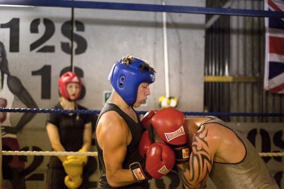
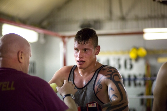
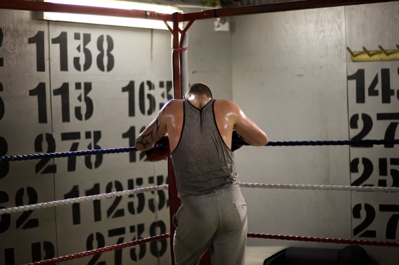
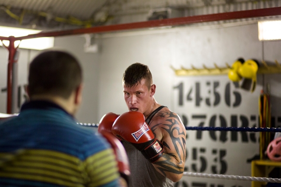
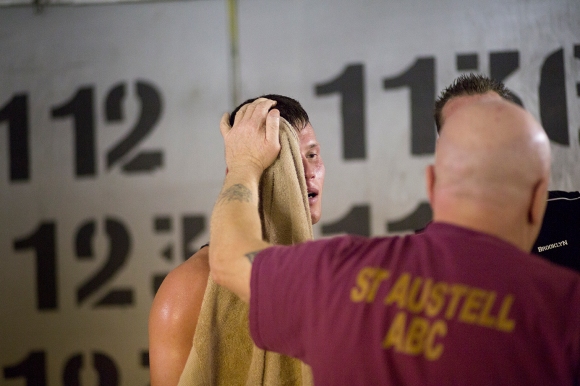
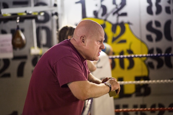
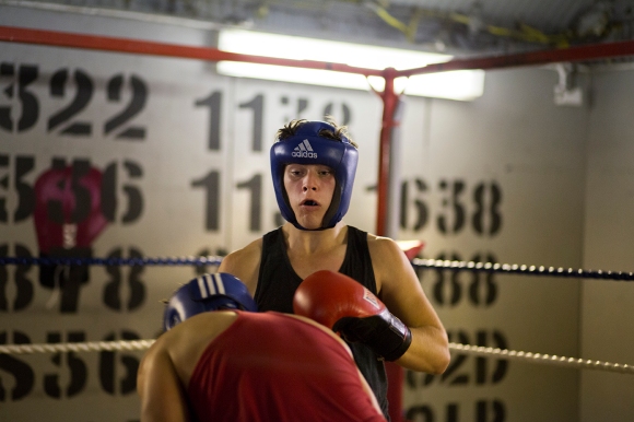
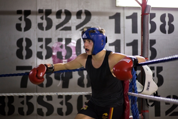
St Austell Boxing Club, 15th October 2014

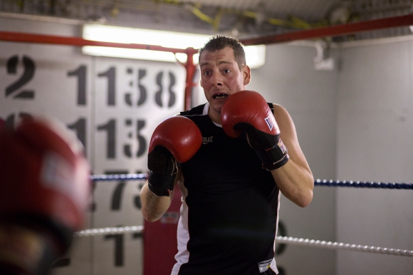
Last Wednesday I attended the night time senior training session at St Austell Boxing Club in Cornwall to photograph boxing as part of a 10 Part Portfolio I am currently working on for my degree course. Before this, I’d never photographed sports as I’m not particularly interested in sports or sports photography but I found the physical and mental strategies in boxing incredibly rewarding to photograph.

The aim for the portfolio is to have one photograph from many of the elements that make up ‘Press & Editorial Photography’ – News/Event, Sports, Fashion, Mini Feature, Observed Portrait, Lit Portrait, Group Portrait, Creative Standalone, Music, Product/Still Life.
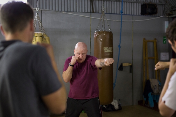
St Austell Boxing Club, 15th October 2014Jimmy Waugh, owner of the club teaches a simple ‘jab-jab-punch’ to students on their first day of training.

St Austell Boxing Club, 15th October 2014St Austell Boxing Club, 15th October 2014St Austell Boxing Club, 15th October 2014St Austell Boxing Club, 15th October 2014St Austell Boxing Club, 15th October 2014

During editing I realised that although I went to St Austell Boxing Club to photograph a sports action shot for the 10 Part Portfolio, I seem to naturally want to tell a story through a set of pictures. This is something I wasn’t doing consciously. You’ll see in the following pictures that there was one particular boxer that I was particularly interested in photographing as he seemed to have a real drive for the sport and was incredibly focused. I’ve managed to make an edit that I think could be used as a mini-feature about him and his boxing. (I’m still to learn their names and will clarify next week!)
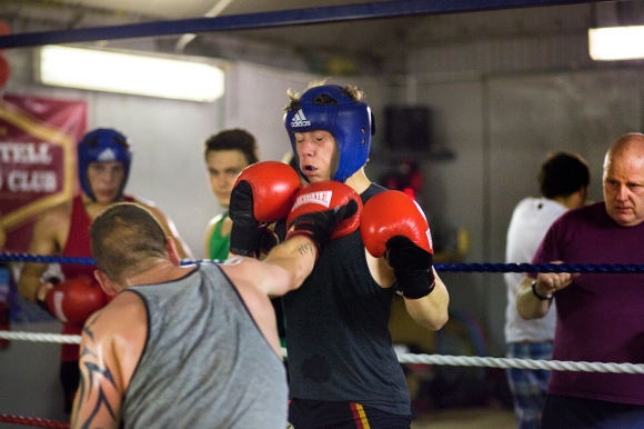
St Austell Boxing Club, 15th October 2014St Austell Boxing Club, 15th October 2014St Austell Boxing Club, 15th October 2014St Austell Boxing Club, 15th October 2014St Austell Boxing Club, 15th October 2014St Austell Boxing Club, 15th October 2014Photographing this club has lead me to want to go back and try doing some lit portraits of the boxers moments after they come out of the ring. It will allow me to get to know them better and to continue their story. The energy in the room was something I really can’t describe in words, so I hope that by making photographs of their portraits at this adrenaline filled moment will allow me to understand and communicate the incredible energy I felt in their space.

The shoot will take place this Wednesday so keep an eye out on here for the photographs. 
Tagged , , , , , , , , ,

Adam Burton in preparation for his role as Mr. Stanford in The Drowned Man: A Hollywood Fable by Punchdrunk Theatre and in association with The National Theatre, The Old Paddington Post Office, London, 3rd July 2014

An Actor Prepares

Once a week, Adam Burton receives physiotherapy and acupuncture treatment from the company’s own therapist to treat a groin and knee injury, both of which occured during performances of The Drowned Man.

An Actor Prepares

Adam Burton eats his dinner of chicken thigh, avocado and salad leaves with one litre of chocolate milk in preparation for the evening show.

An Actor Prepares

Before each show, Adam Burton completes his warm-up routine in preparation for the physically demanding role he plays as Mr. Stanford.

An Actor Prepares

Adam Burton shaving for his role as Mr. Stanford.

An Actor Prepares

Adam Burton changing into costume in the mens dressing room.

_MG_9993blog

Adam walks through the audience prepared building where he will begin his role as Mr. Stanford.

An Actor Prepares


Adam Burton sits and waits for the first members of the audience to arrive into the room where he will begin his role as Mr. Stanford in The Drowned Man: A Hollywood Fable by  Punchdrunk Theatre, The Old Paddington Post Office, London, 3rd July 2014

Tagged , , , , , , , , , , , , , , , , , , , , , , , , ,

Final Spreads!

Final Submission:

Image

Image

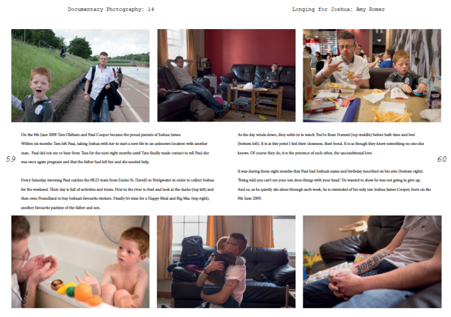
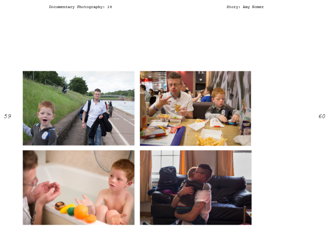
When writing the piece I realised that the tattoo was an important element of the story and so I had to make a decision as to where it would go and what I would take out as I think 7 images would be too busy on the page.

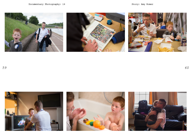
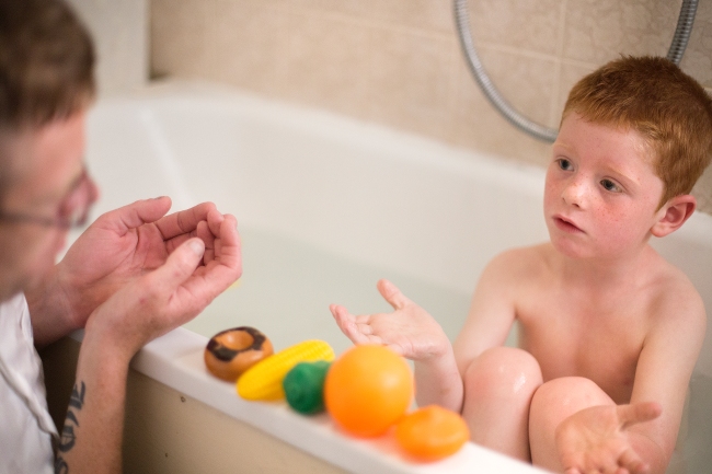
I decided to take the picture of Josh looking up at his Dad in the living room because Josh in the bath looking up at his Dad represents the same thing.

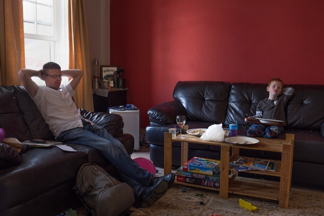
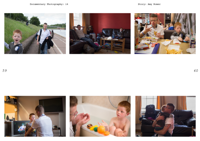
I considered taking out the top middle picture with the red walls in the background because I felt it was in danger of being too similar to the establishing page but I decided that the content was different enough and the unconcious mirroring of Paul and Joshua on the sofa was important. Also, they aren’t on the same page so having a similarity like that in’t really too much of an issue.

ImageImage


Tagged , , , , , , , , , , , , , , , , , , , , , , , , , , , , , , , ,

The second page

How will my choice of establishing page affect the edit? 

Image

Image


If I am to choose this layout I have to sacrifice the following:

Image

I don’t particularly want to lose this picture but I don’t think I can use it alongside the establishing shot. The scene is too similar despite being at different times of day. I think it’s unfortunately worth losing this in the edit in order to have the establishing shot as it is.

Image

Image

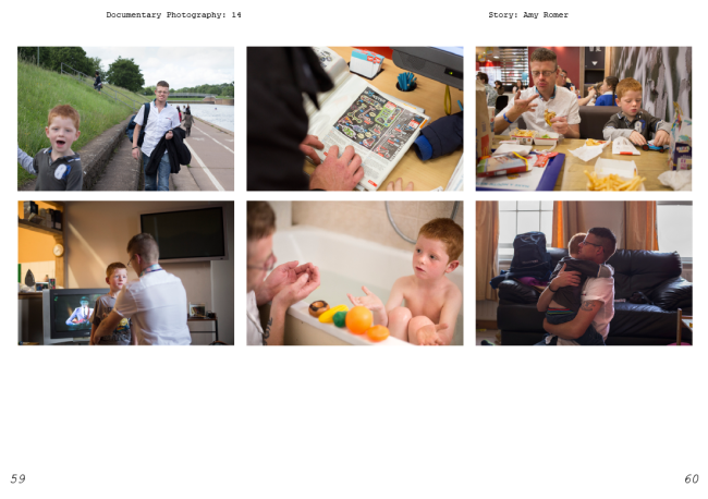
My original edit. I think these moments are more interesting and tell more of a story than the narrative of a typical day for Paul and Joshua, which is how I edited some of the layouts in previous blog posts. Words can easily describe the simpler pictures I’ve missed out but I think it’s pictures like some of these that give photography it’s place in art and storytelling, as words fail to describe easily these moments in our lives.

Second page design alternative

Image


I think having six pictures that are all the same rectangular format limits the design as I don’t want to crop my images. I know in reality they might be cropped but I don’t really see a need and barely an opportunity so I’m happy to leave them.

I think between this and the original design, I prefer the original. The pictures need space between them as they work well in threes: the top being the activities and the bottom being at home.

Tagged , , , , , , , , , , , , , , , , , , , , , , , , , , , ,

Decision Making

Having spoken to people who have been following this blog…(namely my Mum and my housemates), I’ve narrowed my decision down to these three designs.


Design 1

Image

I think Design 1 is likely to be the final submission because the text truly belongs on the picture. The font, colours, positioning and even how the text looks lit up from the natural light on the wall.


Design 2

Image

This was a favourite amongst people but I feel that the headline looks as though it has been placed there through default, as there is nowhere else for it to go, which is the truth. There needs to be more space between Joshua and the headline, and this is more evident when we can see the perfection of the above design.


Design 3

Image

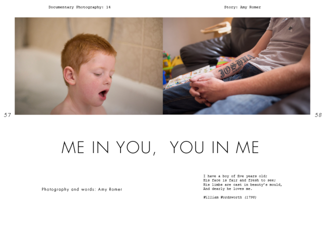
I still can’t move away from this initial design although it was only my Mum that agreed with me. I just really like how the headline works alongside the images. However, it received criticism that when in context with a double page it might look too divided because of the headline having two bits to it and the pictures being quite different. It was also thought that the tattoo detail looks as though it belongs within the story but maybe not as an establishing shot, which I think is a valid point.


So all in all, I think it’s likely I’ll choose Design 1 but I’m going to print out all 3 in preparation for submission to see how it looks physically on paper.

Tagged , , , , , , , , , , , , , , , , , , , , , , , , , , ,

Design 7: Longing for Joshua

Image

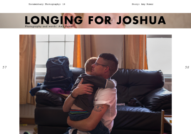
I always thought this picture would work as an establishing shot as it shows a beautiful but quite an emotional moment between Paul and Joshua making it a strong picture but also descriptive. However I wanted to try and work with the others first as I knew I could do more with them in terms of design.

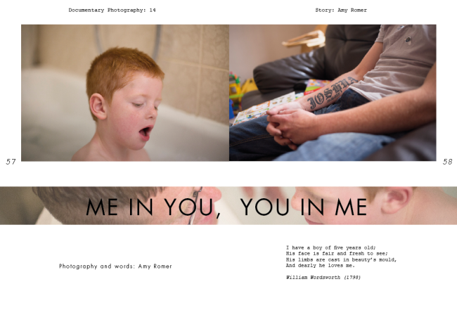
I’ve also tried to think of something different with the title by placing a strip of picture behind it and turning down the opacity – something very simple but potentially effective.

I like the design but somehow it has more of a feeling of being a film poster rather than the opening of a photographic picture story…I might be trying too hard when actually, simple is best!


Variation

Image

I thought I’d see how it worked on my original design. Using the picture from Design 5, I cropped it so that both faces were in the strip, which are then opposites of the two establishing shots above, emphasising the meaning of the headline.

Again, maybe this is too busy? Is it necessary to try and be clever like this and will the busy page just lose the attention of the reader?


Tagged , , , , , , , , , , , , , , , , , , , , , , , ,

Design 6: Longing for Joshua

Variation 1

Image

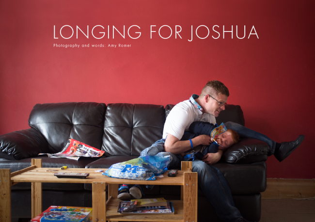
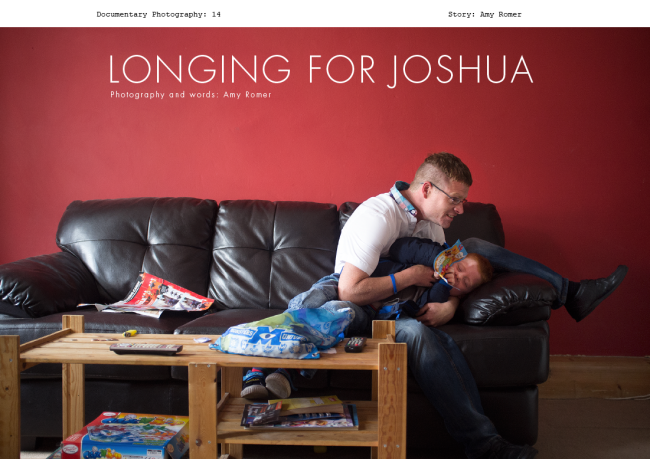
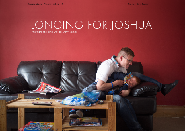
Once again keeping the same title, I’ve changed the establishing shot to one that I specifically shot in mind of using for the opening of an editorial. The long red wall gave me an obvious opportunity to shoot like this as Paul and Joshua played on the sofa not so long after we arrived at the flat.

In Design 6 Variation 1 I’ve kept the same design as Design 5 Variation 1, just replacing the image and changing the colour of the Futura font from black to white on the image so it stands out better and is another element I quite like!

I think I prefer this image as an establishing shot than Design 5 as it is more true to the reportage style of the story. Also I think the contrast between the playfulness of the picture and the more serious headline may make a reader wish to turn the page and find out what it’s about.


Variation 2

Image

I think this is the point where it’s obvious that this picture has been created specifically to be written on as it actually works so well with text over it. Saying that, I still really like Variation 1 and I’d say choosing between Variation 1 and Variation 2 would be a matter of personal taste.

In Variation 2 I’ve kept the same design as in Design 4 where I keep a strip of white along the top to place the title of the magazine and who the article is which I think works well as it means that there would be consistency throughout the editorial as well as looking aesthetically pleasing.


Variation 3

Image


This time I thought I’d see what it looked like with the title of the magazine over the top of the image. To me, it looks as though it doesn’t belong there and ruins the crispness of the design so it either needs to be Variation 2 or it needs to be taken away altogether.


Variation 4

Image


This does look much crisper but I’m not sure I agree with the idea of a page in a magazine not giving you any context as to what the magazine is, so I’m probably happier with Variation 2 in terms of placing headlines over images although I still really like Variation 1 where the headline is above the image.


Tagged , , , , , , , , , , , , , , , , , , , , , , , , , ,

Design 5: Longing for Joshua

Image

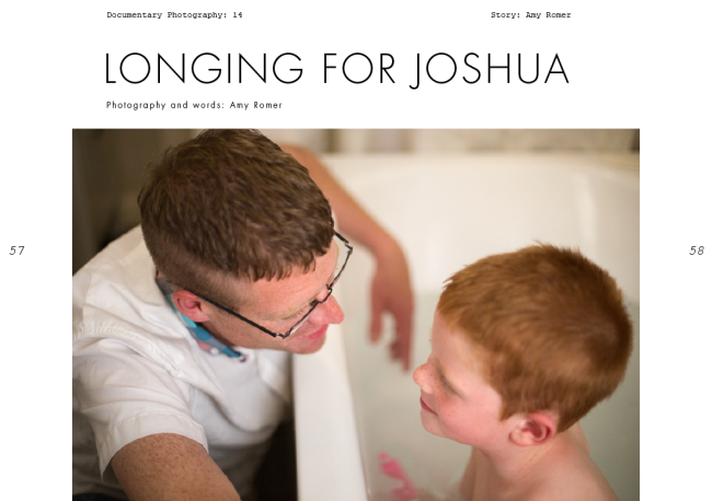
Keeping the same title, I have changed the establishing shot to one that may be more descriptive but that I can’t use as a full page bleed. This is a nice moment between father and son and works well as an establishing shot to open the story. We are introduced to both subjects and although the picture is a beautiful moment, we know from the headline that there is a story somewhere.

Possible faults: Maybe I’d like to see more of the picture in focus? I was working with really low light by this point and so I was using an aperture of f/1.4, (which is one of the reasons why I think the portrait of Josh on his own is so beautiful) but here I find despite thinking this is a lovely moment, I want more of the picture to be in focus and the fact that it isn’t makes it a little distracting.

Also, if I were to use this as an establishing image, it would rule of being able to use the following shot:

Image

…And I think this is a shot that can’t be missed out!


Variation 1

Image

Image

I’ve had my eye on spreads like this from Parallax Magazine on Behance that place text partly on the image. With unfussy out of focus parts of images like this I think it works well and stands out as being a little different.

I think it works well on the picture I’ve chosen and is a design I’d happily use.


Variation 2

Image


My Dad sent me a couple of ideas for headlines, Windows on Fatherhood being one of them. I had to phone him and ask him what it was referring to and he explained that it was the idea of the windows being the photographs, so ‘photographs of fatherhood’.

He really likes it and so do I but I’m not sure I want the attention to about the physical object of a photograph. Instead, I want people to  focus on making the story real for people.

So for this reason I think I’m going to stick with either Longing for Joshua or Me in You, You in Me.

Tagged , , , , , , , , , , , , , , , , , , , , , , , , , ,

Design 4: Longing for Joshua, full page bleed

Image

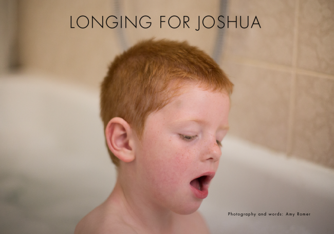
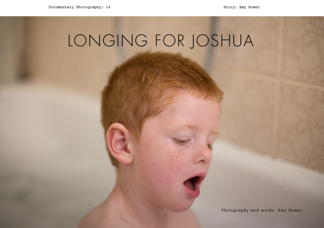
Whilst working with this shot on the establishing pages of designs 1-3 I was aware that there was enough space in this image to use it as a full bleed to place text over the top of it.

You may remember from my posts whilst researching editorials and designing Longevity that I was fairly against the idea of  placing text over the top of image. I find it’s often done badly and as a result is really distracting to both the image and the writing, making me as a ‘reader’ too aware of the design elements than of the story/image.

BUT…I need to give it a go and I did shoot certain shots with this in mind to see if I could achieve a design that was a little more out of my comfort zone in terms of aesthetics and design.

In fact, placing the text over the top of this image does not bother me at all and I think it works really nicely.

Never Lazy Magazine, ISSUU

Below is a similar head and shoulders portrait that has been used as the establisher to a photo story. In this example, I find that the headline kissing his face and quote that overlaps his shoulders is distracting, despite the portrait being decent.

Screen shot 2014-02-24 at 12.39.07

What I do like is how the headline mirrors the tones of the picture, so I’ve tried some for my own:


Screen Shot 2014-06-28 at 15.42.55 Screen Shot 2014-06-28 at 15.50.48


Although the colour below looks more fitting with the tones of the picture, ‘Photography and words: Amy Romer’ gets a little lost in the picture. Looking back at the black headline, it certainly looks more defined and jumps out at you more than this.


I left the title of the magazine at the top as I like the design element but also because there isn’t enough room at the top of the image to place it within the frame.

The problem I faced when designing this was thinking up a headline that made up for the absence of Paul because this picture alone does not really tell us too much about the story. The headline therefore needed to be descriptive.

I’m still unsure as to whether this is enough to lead someone into the story. I think the picture is strong but I wonder if there are too many questions without Paul in the frame? Or maybe the focus on Joshua is a good thing and it’s as though the viewer is looking from the eyes of Paul?

I think it’s something I’m going to get some opinions on before deciding.

Tagged , , , , , , , , , , , , , , , , , , , , , , , , , , , ,

Design 3: Two Establishing Shots

Image

A minor change from Design 2 as this time I have joined up the two images in the central gutter. I think for the establishing page it could be a good thing to do as these two pictures stand for one thing. They are not two separate elements to the story and neither are they the beginning of the narrative; they just act as a collective summary.

Image


I’ve tried to see how the story works if I limit the amount of pictures within it. Below are the pictures I took out:

_MG_0394 _MG_0213

I took these two pictures out as they don’t contribute to the story as such. However, having taken them out and looking at the four that remain, I do think they contribute to the overall story about the relationship between Paul and Joshua. They are the quieter moments, which can be as important as the ‘doing’ moments.


Tagged , , , , , , , , , , , , , , , , , , , , , , , , , , , ,