
A nice little feature on the Left A Bit blog: http://leftabitblog.tumblr.com


The more I look the more I see. An obvious thing to say but as a photographer, it can be hard to see – particularly when you don’t know what you’re looking for.
This work has varying purposes. Firstly, it is a university project which is an open brief that I am creating as I go along.
Secondly, it is work that can be used by The Green Party for promotion, their website, social media, etc.
Thirdly, the nature of the subject matter and the fact that the general election is just around the corner, means that I’m now wondering who and where might publish my work.
On reflection of the weekend, I definitely found myself being pulled in various directions to please and meet the needs of others, which I think clouded my vision as a student trying to do a mini-feature on canvassing in London (which was the unofficial brief I’d written for myself for the weekend).
However, I think what I’ve got out of the weekend is something different to what I’d set out for, and is certainly not worse than what I’d planned. It’s just less prescribed and less linear.
It’s long-form story telling. And it will require more shoots with an open mind and eyes wide open.
I have to say it’s surprisingly relieving to not know what you’re looking for.
All images Amy Romer © 2015. All rights reserved.

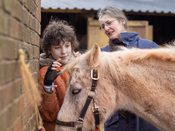
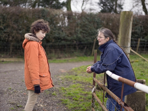
I’m in the middle of captioning my new story and have asked my kind subjects Kate, John and Alfred to check over what I’ve written in order to make sure I’m not about to misinform anyone about their lives!
The story is about the relationship between Alfred and his Mother Kate. Alfred has Asperger’s syndrome.
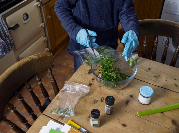
Here’s a sneak peak of the story.
All images © Amy Romer 2015
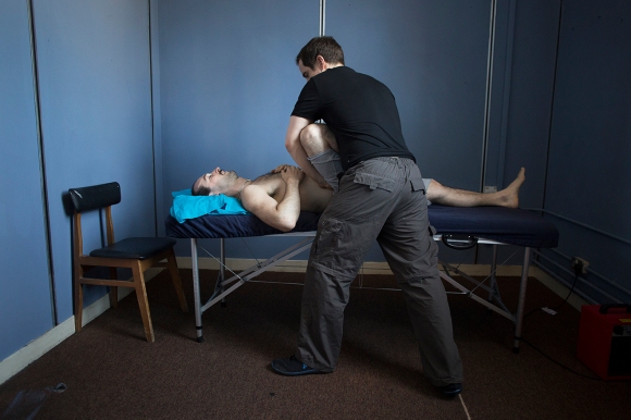
Once a week, Adam Burton receives physiotherapy and acupuncture treatment from the company’s own therapist to treat a groin and knee injury, both of which occured during performances of The Drowned Man.
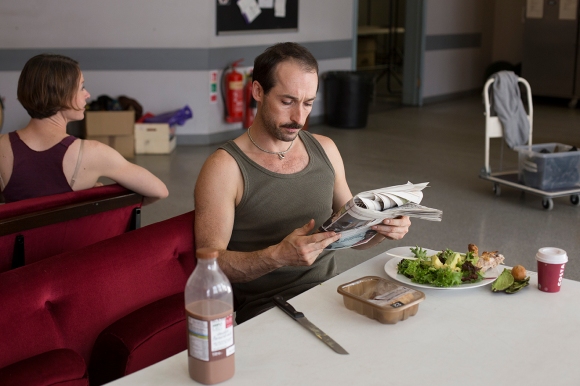
Adam Burton eats his dinner of chicken thigh, avocado and salad leaves with one litre of chocolate milk in preparation for the evening show.
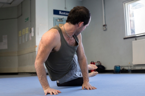
Before each show, Adam Burton completes his warm-up routine in preparation for the physically demanding role he plays as Mr. Stanford.
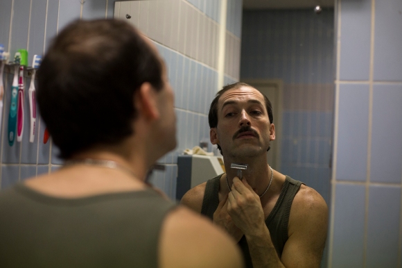
Adam Burton shaving for his role as Mr. Stanford.
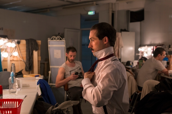
Adam Burton changing into costume in the mens dressing room.

Adam walks through the audience prepared building where he will begin his role as Mr. Stanford.

Adam Burton sits and waits for the first members of the audience to arrive into the room where he will begin his role as Mr. Stanford in The Drowned Man: A Hollywood Fable by Punchdrunk Theatre, The Old Paddington Post Office, London, 3rd July 2014
Final Submission:


When writing the piece I realised that the tattoo was an important element of the story and so I had to make a decision as to where it would go and what I would take out as I think 7 images would be too busy on the page.
I decided to take the picture of Josh looking up at his Dad in the living room because Josh in the bath looking up at his Dad represents the same thing.
I considered taking out the top middle picture with the red walls in the background because I felt it was in danger of being too similar to the establishing page but I decided that the content was different enough and the unconcious mirroring of Paul and Joshua on the sofa was important. Also, they aren’t on the same page so having a similarity like that in’t really too much of an issue.


How will my choice of establishing page affect the edit?


If I am to choose this layout I have to sacrifice the following:

I don’t particularly want to lose this picture but I don’t think I can use it alongside the establishing shot. The scene is too similar despite being at different times of day. I think it’s unfortunately worth losing this in the edit in order to have the establishing shot as it is.


My original edit. I think these moments are more interesting and tell more of a story than the narrative of a typical day for Paul and Joshua, which is how I edited some of the layouts in previous blog posts. Words can easily describe the simpler pictures I’ve missed out but I think it’s pictures like some of these that give photography it’s place in art and storytelling, as words fail to describe easily these moments in our lives.
Second page design alternative

I think having six pictures that are all the same rectangular format limits the design as I don’t want to crop my images. I know in reality they might be cropped but I don’t really see a need and barely an opportunity so I’m happy to leave them.
I think between this and the original design, I prefer the original. The pictures need space between them as they work well in threes: the top being the activities and the bottom being at home.
Having spoken to people who have been following this blog…(namely my Mum and my housemates), I’ve narrowed my decision down to these three designs.
Design 1

I think Design 1 is likely to be the final submission because the text truly belongs on the picture. The font, colours, positioning and even how the text looks lit up from the natural light on the wall.
Design 2

This was a favourite amongst people but I feel that the headline looks as though it has been placed there through default, as there is nowhere else for it to go, which is the truth. There needs to be more space between Joshua and the headline, and this is more evident when we can see the perfection of the above design.
Design 3

I still can’t move away from this initial design although it was only my Mum that agreed with me. I just really like how the headline works alongside the images. However, it received criticism that when in context with a double page it might look too divided because of the headline having two bits to it and the pictures being quite different. It was also thought that the tattoo detail looks as though it belongs within the story but maybe not as an establishing shot, which I think is a valid point.
So all in all, I think it’s likely I’ll choose Design 1 but I’m going to print out all 3 in preparation for submission to see how it looks physically on paper.

I always thought this picture would work as an establishing shot as it shows a beautiful but quite an emotional moment between Paul and Joshua making it a strong picture but also descriptive. However I wanted to try and work with the others first as I knew I could do more with them in terms of design.
I’ve also tried to think of something different with the title by placing a strip of picture behind it and turning down the opacity – something very simple but potentially effective.
I like the design but somehow it has more of a feeling of being a film poster rather than the opening of a photographic picture story…I might be trying too hard when actually, simple is best!
Variation

I thought I’d see how it worked on my original design. Using the picture from Design 5, I cropped it so that both faces were in the strip, which are then opposites of the two establishing shots above, emphasising the meaning of the headline.
Again, maybe this is too busy? Is it necessary to try and be clever like this and will the busy page just lose the attention of the reader?
Variation 1

Once again keeping the same title, I’ve changed the establishing shot to one that I specifically shot in mind of using for the opening of an editorial. The long red wall gave me an obvious opportunity to shoot like this as Paul and Joshua played on the sofa not so long after we arrived at the flat.
In Design 6 Variation 1 I’ve kept the same design as Design 5 Variation 1, just replacing the image and changing the colour of the Futura font from black to white on the image so it stands out better and is another element I quite like!
I think I prefer this image as an establishing shot than Design 5 as it is more true to the reportage style of the story. Also I think the contrast between the playfulness of the picture and the more serious headline may make a reader wish to turn the page and find out what it’s about.
Variation 2

I think this is the point where it’s obvious that this picture has been created specifically to be written on as it actually works so well with text over it. Saying that, I still really like Variation 1 and I’d say choosing between Variation 1 and Variation 2 would be a matter of personal taste.
In Variation 2 I’ve kept the same design as in Design 4 where I keep a strip of white along the top to place the title of the magazine and who the article is which I think works well as it means that there would be consistency throughout the editorial as well as looking aesthetically pleasing.
Variation 3

This time I thought I’d see what it looked like with the title of the magazine over the top of the image. To me, it looks as though it doesn’t belong there and ruins the crispness of the design so it either needs to be Variation 2 or it needs to be taken away altogether.
Variation 4

This does look much crisper but I’m not sure I agree with the idea of a page in a magazine not giving you any context as to what the magazine is, so I’m probably happier with Variation 2 in terms of placing headlines over images although I still really like Variation 1 where the headline is above the image.
